CSS Tables
HTML
<div class="display_table">
<div class="display_tablecell">
<img src="css/IMG_3067.jpg">
</div>
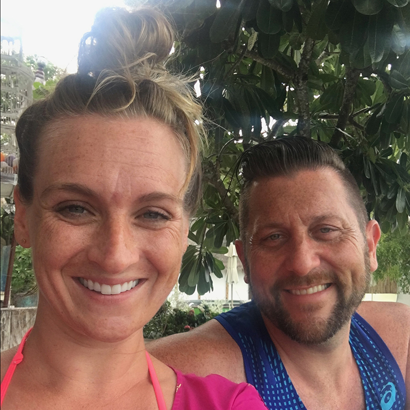
<div class="display_tablecell">
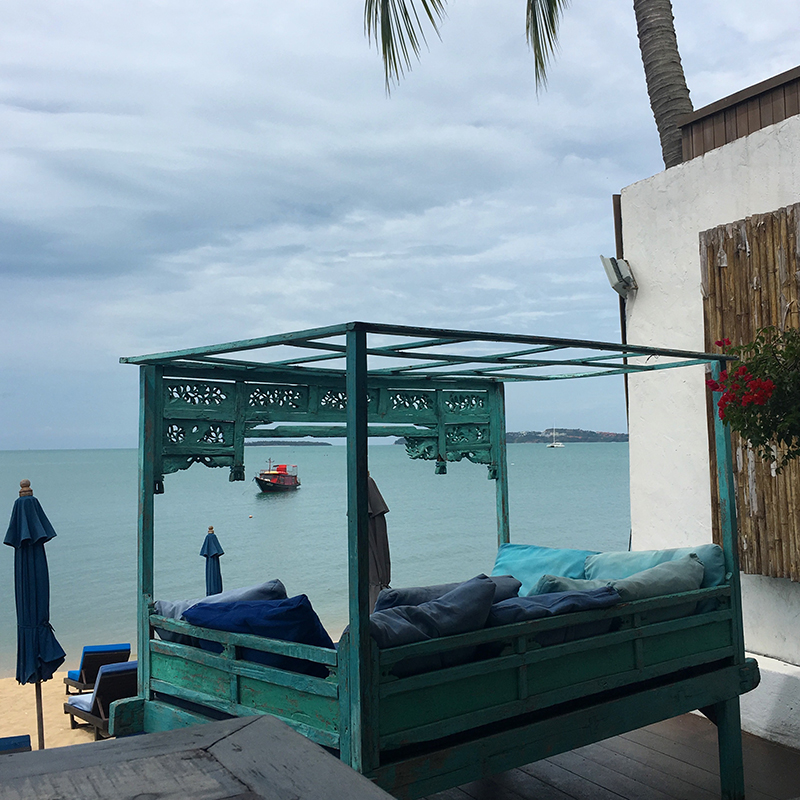
<img src="css/IMG_3074.jpg">
</div>
<div class="display_tablecell">
<img src="css/IMG_3010.jpg">
</div>
<div class="display_tablecell">
<img src="css/IMG_2929.jpg">
</div>
</div>
CSS
.display_table {
    display: block;
    border: 1px solid black;
    margin: 20px 0;
}
.display_tablecell {
    display: block;
    border: 1px solid black;
    vertical-align: middle;
}
.display_tablecell > img {
    max-width: 400px;
}
@media screen and (min-width: 920px) {
    .display_table {
        display: table;
        width: 100%;
        border: 1px solid black;
        margin: 20px 0;
    }
    .display_tablecell {
        display: table-cell;
        border: 1px solid black;
    }
}
Vertical center text over image - line height
Koh Samui
Koh Samui
Thailand
HTML
<div class="gallery">
    <div class="gallery-image">
        <img src="css/IMG_3074.jpg" />
        <div class="gallery-text">
            <div>Koh Samui</div>
        </div>
    </div>
</div>
<div class="gallery">
    <div class="gallery-image">
        <img src="css/IMG_3074.jpg" />
        <div class="gallery-text1">
            <div>Koh Samui</div>
        </div>
    </div>
</div>
<div class="gallery">
    <div class="gallery-image">
        <img src="css/IMG_3074.jpg" />
        <div class="gallery-text2">
            <div>Thailand</div>
        </div>
    </div>
</div>
CSS
.gallery {
    max-width:300px;
    max-height:300px;
    position: relative;
    padding: 0;
    margin: 0;
    text-align: center;
    margin: 0 auto;
}
.gallery-image{
    cursor:pointer;
    position: relative;
    display: block;
}
.gallery-image img{
    max-width:300px;
    max-height:300px;
}
.gallery-text{
    position: absolute;
    top: 0; right: 0;
    bottom: 0; left: 0;
    width: 300px;
    height: 300px;
    text-align: center;
    background-color: rgba(0,0,0,0.8);
    opacity: 0;
    -webkit-transition: opacity 0.6s;
    -moz-transition: opacity 0.6s;
    transition: opacity 0.6s;
    vertical-align: middle;
    line-height: 300px;
}
.gallery-text:hover{
    opacity: 1;
}
.gallery-text div{
    color: white;
    display: inline-table;
    vertical-align:middle;
}

.gallery-text1{
    position: absolute;
    top: 0; right: 0;
    bottom: 0; left: 0;
    width: 300px;
    height: 300px;
    text-align: center;
    vertical-align: middle;
    line-height: 300px;
}
.gallery-text1 div{
    color: white;
    display: inline-table;
    vertical-align:middle;
}

.gallery-text2{
    position: absolute;
    top: 15%; right: 15%;
    bottom: 15%; left: 15%;
    text-align: center;
    background-color: rgba(255,255,255,0.8);
    opacity: 1;
    vertical-align: middle;
    line-height: 200px;
}
.gallery-text2 div{
    color: black;
    display: inline-table;
    vertical-align:middle;
}
Vertical Align - vertical align middle
Hoodie man bun craft beer succulents
cardigan pork belly fingerstache
HTML
<div class="banner-image banner-padding-bottom">
    <div class="outer-table-cell">
        <div class="inner-table">
            <div class="inner-tablecell">
                <img src="css/thaisquare.jpg">
                <div class="text-line">Hoodie man bun craft beer succulents</div>
                <div class="text-line">cardigan pork belly fingerstache</div>
            </div>
        </div>
    </div>
</div>
CSS
.banner-image {
    /* FOR RESPONSIVE BACKGROUND IMAGE SWAP BACKGROUND COLOR FOR IMAGE */
    background-color: linen;
    background-repeat: no-repeat;
    background-size: cover;
    margin-bottom: 30px;
}
.banner-padding-bottom {
    padding-bottom:44%;
    position:  relative;
    height:0;
}
.outer-table-cell {
    display: table-cell;
    vertical-align:middle;
    height: 100%;
    text-align: center;
    position: absolute;
    right: 5%;
    color: #000;
}
.inner-table {
    display: table;
    height: 100%;
}
.inner-tablecell {
    display: table-cell;
    vertical-align: middle;
    border: 1px solid black;
}
.inner-tablecell img {
    margin: 0 auto;
    height: auto;
    width: 100px;
}
.text-line {
    display:none;
    font-size: 14px;
}
@media (min-width:414px) {
    .outer-table-cell {
        right: 10%;
    }
}
@media (min-width:600px) {
    .inner-tablecell img {
         width: 150px;
    }
    .outer-table-cell {
        width: 200px;
        right: 0;
    }
}
@media (min-width:768px) {
    .outer-table-cell {
        width: 300px;
        right: 5%;
    }
    .text-line {
        display:block;
    }
    .banner-padding-bottom{
        padding-bottom:36.5%;
    }
    .inner-tablecell img {
        margin-bottom: 15px;
    }
}
Responsive Image with "Vertical-Align: Middle" Text
HTML
<div class="banner-padding-bottom2">
    <div class="banner-image2">
        <div class="inner-table2">
            <div class="inner-tablecell2">
                <div class="text-line">Hoodie man bun craft beer succulents</div>
            </div>
        </div>
    </div>
</div>
CSS
.banner-padding-bottom2 {
    padding-bottom: 44%;
    position:  relative;
    height:0;
}
.banner-image2 {
    position: absolute;
    background-image: url('EG3C9957.jpg');
    background-repeat: no-repeat;
    background-size: cover;
    height: 100%;
    width: 100%;
    top:0;
    left:0;
}
.inner-table2 {
    display: table;
    height: 100%;
    width: 100%;
}
.inner-tablecell2 {
    display: table-cell;
    vertical-align: middle;
    color: #fff;
    font-size: 24px;
    font-weight: bold;
}
HTML Tables
table    { display: table }
tr       { display: table-row }
thead    { display: table-header-group }
tbody    { display: table-row-group }
tfoot    { display: table-footer-group }
col      { display: table-column }
colgroup { display: table-column-group }
td, th   { display: table-cell }
caption  { display: table-caption }